 Lovely workshop to finish with. Colour, abstraction, process, scale – all strongly resonate with me; reflecting back over the course to date, perhaps this is clear throughout in much of what I have already produced. Natural leanings?
Thoroughly enjoyed working with the colour charts as a way back in after half term. Meditative process and easy to get into. I worked with a large scale grid and produced some interesting colour mixes. Despite headache in low lighting conditions, I also enjoyed the afternoon exercise (composition, abstraction, shading and shadows using a still life of folded/torn coloured card as the subject) and liked the results very much. I produced two very different pieces although my approach was the same – I saw 2D shapes and shades and the results were very abstract. To me, one looked like a landscape of field shapes; the other (once turned 90 degrees and given a turquoise background) could have been a portrait or a vase of flowers – it had something of Picasso about it). I decided to stick with a large paint brush throughout, which, if I did the same exercise again, I’d be freer about – because the second piece might have looked better for some greater precision.
Grabbed a book on Rothko from the library and dipping into it, in light of today, feel I am responding to his work in a very different way. Getting strong emotional response to the colour choices and simplicity.
Janie also showed us a couple of pieces by Alex Katz as examples of great use of colour. Looking through his website http://www.alexkatz.com/home, I find his sense of colour inspiring and bold.
I was looking forward to working the largescale abstract paintings very much and loved the process. Before going on lunch, I intuitively decided to work with pale sage greens and dark browns/black/reds (perhaps inspired by Andrew Hardwicks largescale moody pieces next door in the RWA?). I wanted the green to come through around the edges, which I had inadvertently achieved with my second ‘folded cardboard abstract’ from yesterday. Over lunch I sketched out my idea – the majority of the painting would be dark (darker from left to right in thirds), with the light green showing through and the whole thing lifted by 3 red vertical lines on the right. . . this was my process:
Sponged whole area with light sage green/cream

From left to right, added deep pink/red in bold but fading lines using flat 2.5? paint brush

Deepened the colour with brown and then black (at this point Mark suggested it might be a good idea to change brush size so something smaller – I felt I wasn’t quite ready to do so, wanting to darken and deepen even more – so I thickened the ‘dark’ with a palette knife, my hands, whitings). Standing back I also realised that I needed more dark balance on the left.


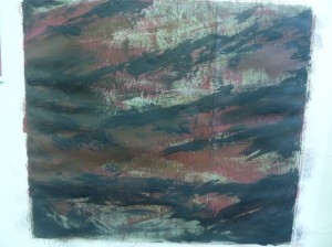
At this point I took a break, got some fresh air, came upon a possible name INCARCERATION (physical, emotional, something about prisoners of war, army training on Dartmoor. . .) and came back to the studio to add finer detail with more definitive lines using paint brush, firstly curved and crossing in the deep pink. . .

and then, wanting to lift and find further definition, with a straight horizontal line at the bottom using the light green (using masking tape for straightness) which looked great

but I still felt it needed something else. Going back to my original concept of vertical red lines on the left and encouraged by Mark to create a different shade than anything before, I added a vertical red line which interweaved in front of and behind the other lines. Really pleased with the final result and with my decision making throughout. What would I change? I think there may be too much background green showing through so perhaps I should have stayed with my original concept of a greater sense of darkness. The straight lines were inspired and life the whole piece. I’m looking forward to seeing it with clean border. Like abstractions of detail.


My peers used the following words in response to the piece: ANGER – URBAN – SADNESS – MENSTRUAL – MOUNTAINS – MONSTER – CAGED – CAVE – PAIN – SHARP – WAR – BARBED WIRE – CONFLICT – CAMOUFLAGE – LANDSCAPE. Spot on and great to receive such emotional and felt responses.
Great day!
Final day and we concentrated on still life and composition, painting large and using watered down acrylics – wet on wet encouraged, which worked well with the theme of my paintings – swimming gear. The soft edges around the solid objects gave the images a watery quality. I didn’t sketch out before hand and used my brushes to draw/capture the form. I’m glad I allowed for drying before adding further definition and am particularly pleased with the way the wording and folds/light/dark works on the swimming hat. Because I was pleased with the result I found it a little perturbing that we had to cut them up for the group exercise on composition, using the wall as our canvas. I enjoyed looking at and critiquing Vera’s four chosen artists – Giorgio Morandi (http://www.tate.org.uk/art/artists/giorgio-morandi-1660), Michael Craig-Martin, Elizabeth Blackadder and Jane Telford.


We were then free to create a still life painting of our choice. I had brought in my Moroccan teapot and I felt that this went well with the jelly mould (silver/transparent/intricate shape and design) and then as a juxtaposition, Sarah’s bold black and red and solid sculpture. For me composition feels very natural and intuitive so the grouping and then the position on the paper came to me very quickly. I worked big, no pencil, built up the layers of paint but kept quite watery except the sculpture. Result below. Mostly pleased, especially the teapot. I made choices about background (keeping it in similar tone/colour to the sculpture) and then (intuitively) obvious brush strokes in yellow (something about it looking old/and also lifting the composition) – which could have been different (lighter background/no yellow) and Vera questioned me about both of these choices. I still feel that I made the right choices. Something I did get wrong though is that the see through jelly mould was painted in before the background and I could not get the background colour ‘behind’ the mould. I would think this through in future.

I think that Vera’s session has really got me thinking about still life, particularly the flat/naive form. I love the way that the essence of objects and feelings/emotions can be captures with simple composition and form. I want to develop this much further.
Elaine Phamphilon @ The Adam Gallery, Bath – visited 11/11. Photos of Eva’s Delicious Rosy Pears (mixed media on wooden panel 30×40 and Motoko’s Jug and Blue Mug on White Cloth (mixed media on canvas 30×40)


http://www.elainepamphilon.com/
followed swiftly by seeing a William Scott at the Victoria Art Gallery: Bottle and Fishslice 1949-50 oil)

(also see http://williamscott.org/)
Tuning into the importance of composition and colour. Responding to the simplicity of the pieces.
See also http://www.jessicacooper.co.uk/
